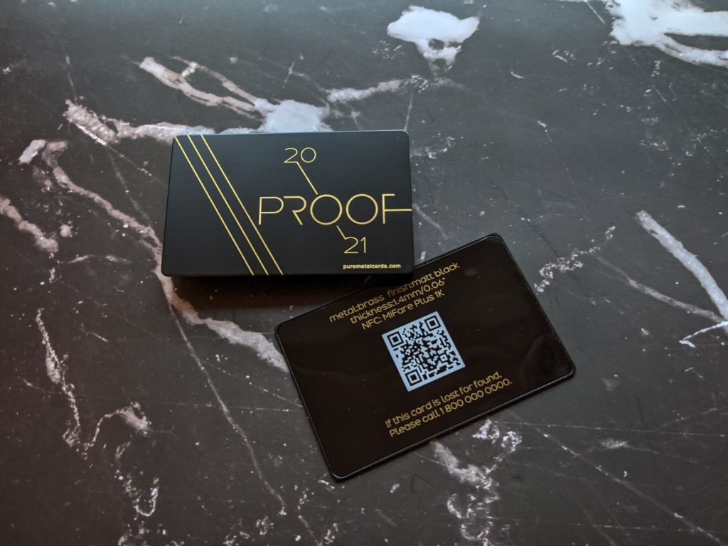
A metal card is a weird little object. It’s tiny, it’s heavy, and it can signal “premium” faster than almost anything you can hand to someone.
Or it can look like an overbuilt business card that scratches itself to death in two weeks.
The difference usually isn’t “better art.” It’s decisions made before you ever send a file to a vendor: what the card is supposed to do, what it’ll be abused by (keys, pockets, UV, salt air), and what you’re willing to trade in cost, weight, and durability.
Start with goals, not gradients
Most metal card projects fail because nobody agrees on the win condition.
If it’s a VIP membership card, success might be “gets shown at the door without staff squinting.” If it’s a sales tool, success might be “people actually keep it.” For an access credential, success can be brutally simple: scan rate and failure rate.
Here’s a simple framework I’ve used that doesn’t turn into a spreadsheet novel:
– Pick 1 primary job: impress / authenticate / unlock / drive response
– Pick 2, 4 metrics you can track: RSVP rate from card recipients, redemption rate, check-in time, scan failure %, retention by cohort
– Assign an owner + a date: otherwise it’s just vibes
Now, this won’t apply to everyone, but if you can’t measure anything, lean into what metal does best: permanence and tactile branding. A strong metal card design should support that goal from the start, because engraving beats “pretty printing” in the long run.
One more thing: establish a baseline before rollout. The card can’t “increase retention” if you never knew your retention.
Hot take: weight is a feature, not a flex
If your metal card doesn’t feel meaningfully different from plastic, you paid for novelty, not impact.
And yes, too heavy is a thing. A card that feels like a pocket pry bar gets left at home. The sweet spot, in my experience, is “noticeably substantial” without punishing wallets and cardholders.
Base metals (how they behave in real hands)
– Stainless steel: tough, corrosion resistant, “serious” feel. Great for engraving.
– Brass: warm, premium, ages visibly (patina can be gorgeous or annoying depending on brand).
– Aluminum: light, easier to anodize in bold colors, dents easier than people expect.
– Copper: striking, but fingerprints and oxidation are constant companions (some brands love that story).
Thickness: small numbers, big consequences
0.8 mm can feel sleek and modern.
1.0, 1.2 mm usually reads as “premium” without being ridiculous.
Go thicker only if you’ve tested wallet fit and you actually want that chunky presence.
Also: tolerance specs matter more than designers think. If your vendor can’t hold edges cleanly at your chosen thickness, you’ll see chipping, uneven bevels, or coatings that break at corners.
Finishes & coatings: the “longevity layer” you don’t see in mockups
Look, the finish is the product. The layout is just riding on it.
Glossy polished metal looks amazing in renderings and atrocious under overhead office lighting if you’re trying to read small type. Matte and brushed finishes photograph well and hide fingerprints. But they can soften contrast if you don’t plan the engraving depth and spacing.
A quick practical map:
– Brushed + deep engraving: legible, durable, hides wear nicely
– Polished + shallow marks: dramatic but fussy; scratches show up fast
– Matte clear coat: reduces glare, can improve perceived quality if done right
– Anodized color (often aluminum): strong color permanence, but edges can reveal wear if not protected
Now, coatings are chemistry, not magic. If you want color stability, UV resistance is real, measurable, and boring (which is good). One relevant data point: the National Renewable Energy Laboratory has published extensive outdoor exposure work showing UV is a primary driver of polymer degradation over time, impacting gloss retention and color shift in many coatings. Source: NREL, Outdoor exposure and weathering testing publications (nrel.gov).
That doesn’t mean your card will live outdoors. It means clear coats and inks have a lifespan, and sunlight in a car is harsher than people assume.
Logo, type, and color: stop designing metal like it’s paper
Metal is reflective. It has grain. It catches light in motion. That changes everything.
Typography (the part everyone underestimates)
Thin fonts that look elegant on screen can collapse on a brushed surface. Tight kerning becomes a smear when light hits at an angle. If the card has to be read quickly at arm’s length, you want sturdy letterforms, slightly more spacing than usual, and a hierarchy that doesn’t rely on color alone.
I’ve seen this work repeatedly:
– Increase type size one step beyond what feels “minimal”
– Add breathing room around engraved text
– Use weight contrast (bold vs regular) rather than micro-size differences
Logo translation: pick what you want to “feel”
Embossing gives you tactile identity. Laser engraving gives you precision. Etching can add personality, but it can also add noise. The trick is restraint: one hero element that catches light, one supporting texture, and everything else stays clean.
Color on metal is also not “color.” It’s contrast plus reflectivity. A deep black on brushed steel reads different than black on anodized aluminum, and both read different under warm indoor lighting. Prototype under at least three conditions: daylight, office LEDs, and dim warm light.
Printing methods & edge finishes (this is where durability gets decided)
Some cards die at the surface. Others die at the edges.
Printing methods, bluntly
Laser engraving is the durability king for text, logos, and serials because there’s no ink layer to rub off. If you need photographic full color, you’re entering trade-off territory: you can get gorgeous gradients, but abrasion will eventually win unless the protective system is excellent.
Here’s the thing: a “perfect” print method isn’t perfect if the card lives next to keys. Your environment decides the spec.
Edge finishing: boring detail, massive payoff
Edges take the first hit. Always.
A clean bevel or radius reduces chipping, snagging, and that cheap “sharp sheet metal” feel. If you want the card to glide in and out of wallets without wearing through coating at corners, you plan the edge early, not after the artwork is approved.
I’m opinionated here: if the vendor can’t show consistent edge samples, don’t trust them with your premium project. Edge consistency is a proxy for process control.
Magnetic vs non-magnetic: cool feature, hidden problems
Do you need magnetic behavior, or do you just like the idea?
Magnets can make display and attachment easy. They can also complicate everything: added thickness, constraints on material choice, potential interference with sensitive items, and finishing challenges near embedded components.
Non-magnetic options tend to be simpler to produce cleanly, with broader finishing compatibility and fewer “surprises” in QA. If your card needs to work with readers, dispensers, sleeves, or wearables, simpler is often smarter.
If you’re integrating electronics, treat shielding, placement, and seam integrity like engineering problems (because they are), not design flourishes.
Real-world use: pockets, pouches, lanyards, and regret
People don’t carry cards like museum pieces. They carry them like clutter.
A metal card that looks pristine in the box can get micro-scratched in a single day if it rides in a pocket with coins or keys. If that matters, you either choose a finish that hides wear, or you provide a storage solution that people will actually use (that second part is harder).
One-line truth:
A premium card with a cheap sleeve feels like a prank.
Think through:
– Wallet slot fit (thickness + edge radius)
– Fingerprint behavior (polished surfaces will betray you)
– Lanyard or wearable mounting (holes, slots, clips change stress points)
– Labeling and organization if users carry multiple cards
And test it. Not theoretically. Physically. I’ve watched teams approve designs that were gorgeous, then discover the card didn’t slide into common holders without scraping the edges.
Budget, timeline, vendor selection (the grown-up part)
If you want fewer mistakes, pay for prototypes. Every time.
Set your budget by phase, not by wish:
– Design + prepress
– Prototype round(s)
– Tooling (if required)
– Production
– QC + packaging
– Shipping + buffer for rework
Timelines also break in predictable places: sampling, finish matching, and QA. Rush fees exist because the slow parts are real.
When picking a vendor, I care less about their marketing photos and more about their answers to annoying questions:
– What tolerances can you hold on thickness, corners, and bevels?
– Which finishes do you warranty against fading or peeling?
– Can you show samples that are one year old (handled, not stored)?
– What happens when a batch fails QC?
– Do you have documented material certs if I need them?
If they get defensive, walk.
If they’re transparent, you’ve probably found a partner.
A great metal card is designed twice: once for how it looks on a screen, and again for how it lives in the real world, scraped edges, fingerprints, harsh lighting, and all. That second design is the one people remember.
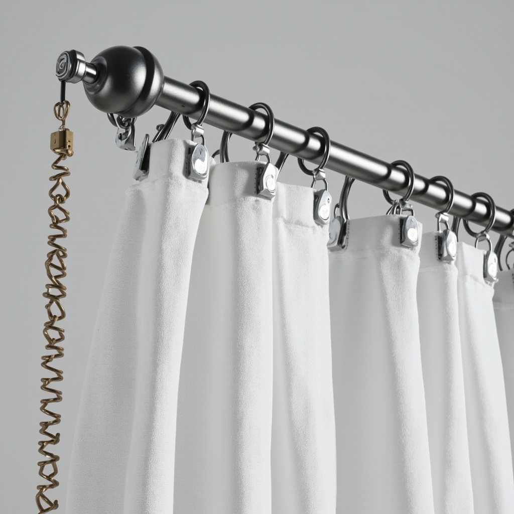 Let’s be honest: nobody buys a curtain pole thinking about physics. You pick it up, you install it, you hang the drapes, and you hope it doesn’t sag. But if you’ve ever wrestled with a flimsy rod that bows in the middle or watched your heavy blackout curtains slowly drag the brackets off the wall, you know the real culprit isn’t your installation skills. It’s the weight distribution mechanics. And in telescopic